Widgets and icon packs are fun, but a simple home screen is the way to go
My phone is a tool, nothing more.
Ever since iOS 14 made its public debut on September 16, there's been a surge in interest around home screen customization. iPhone users now have the opportunity to truly personalize their phone for the very first time, Android folks are finding a renewed interest in tweaking their setups, and my Twitter feed has been endlessly filled with people sharing their unique creations for the world to see. It's been pretty great.
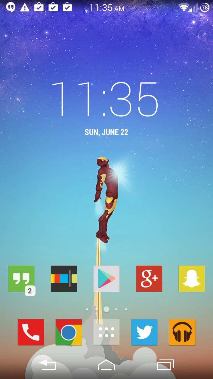
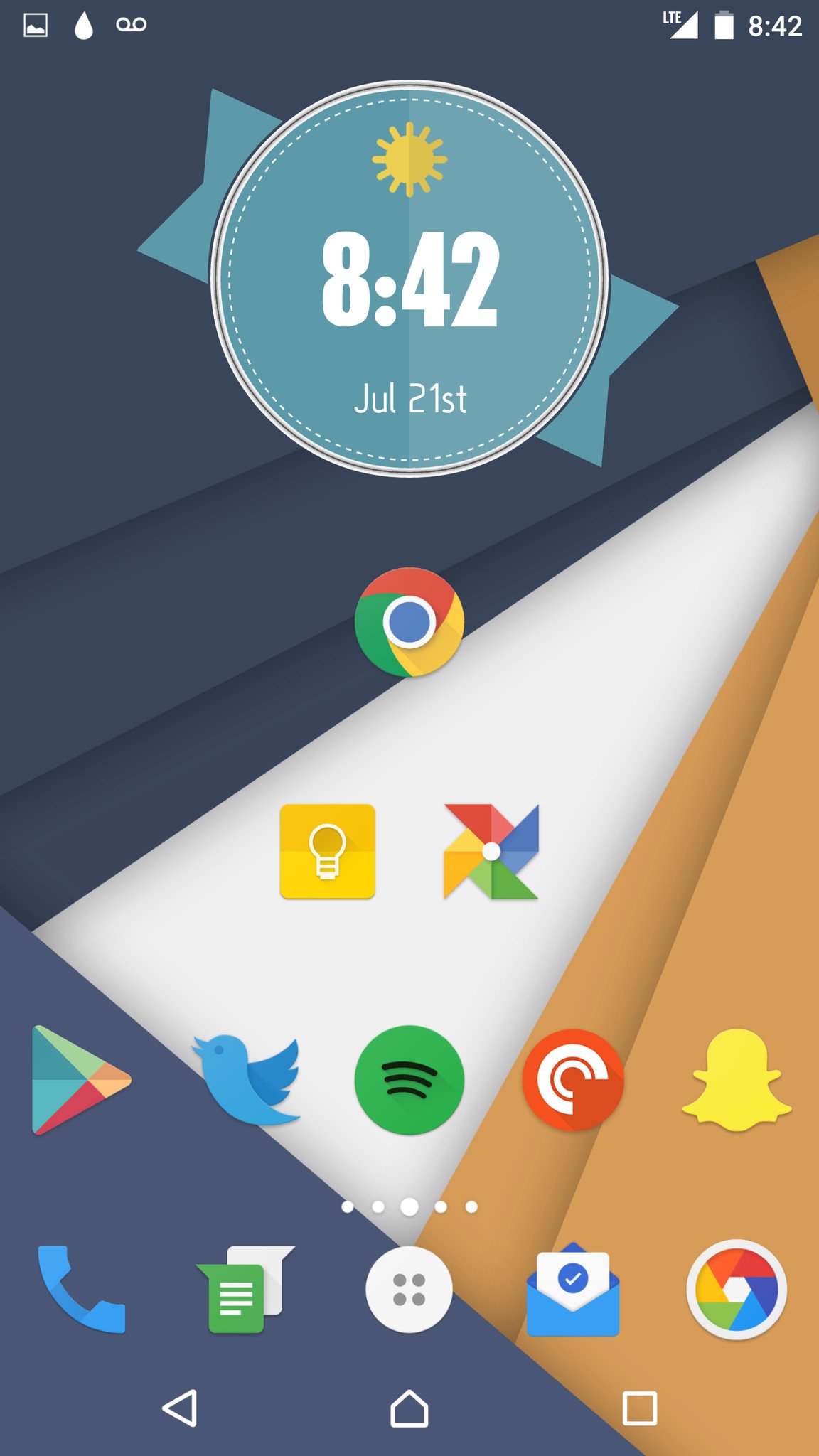
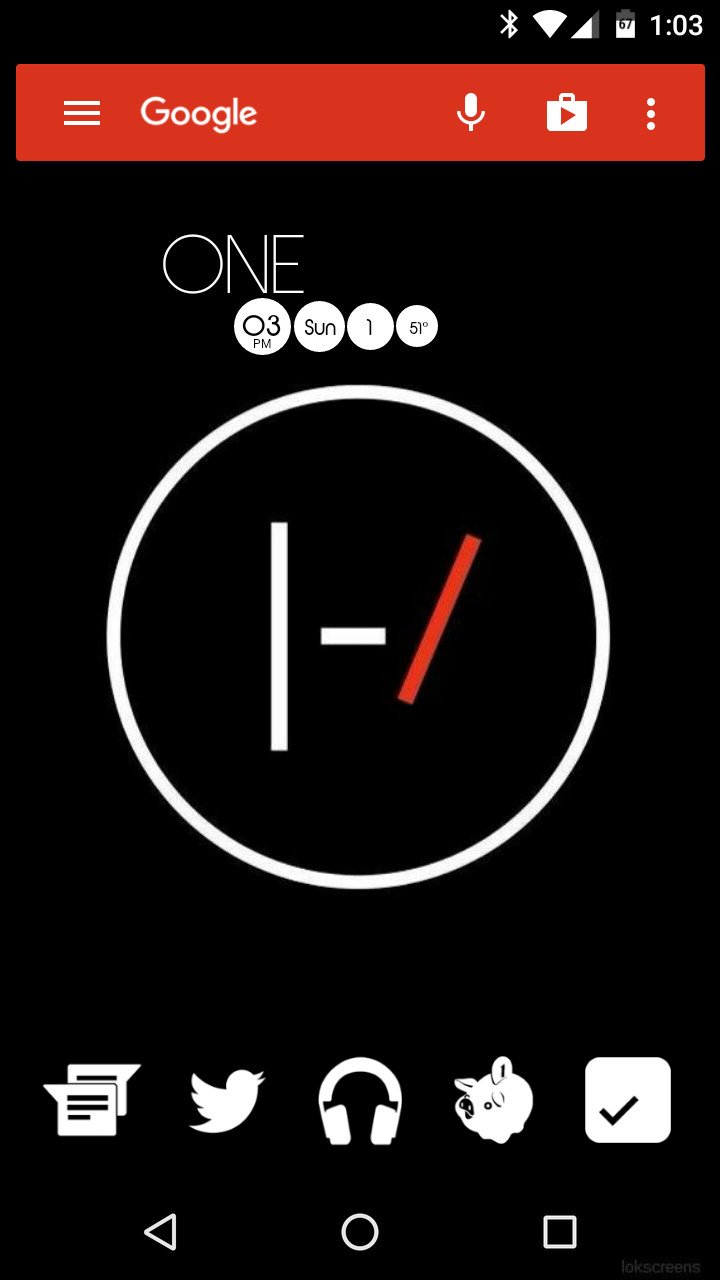
Like many of you reading this, one of the things that initially attracted me to Android over iOS was the sheer amount of customization the platform gives you. Looking back to the days of my Nexus 5 and Moto X (2013), I remember customizing those phones to the nth degree. I'd use custom widget makers, have multiple icon packs installed at any given time, switch between launchers on a fairly regular basis, and had a lot of fun with Xposed Framework modules (specifically, changing the icons for on-screen navigation buttons).
Some days, I'd spend a couple of hours at a time just playing with all of these different tools to make my home screen as perfect as I could get it. I'd use it for a few days, absolutely love it, and then get the itch to do it all over again. Here are just a few examples that I still have saved in Google Photos.
Looking back at these screenshots makes me pretty nostalgic, because to be perfectly honest, I can't remember the last time I went all-out customizing my phone like that.
My home screen hasn't needed a change in years.
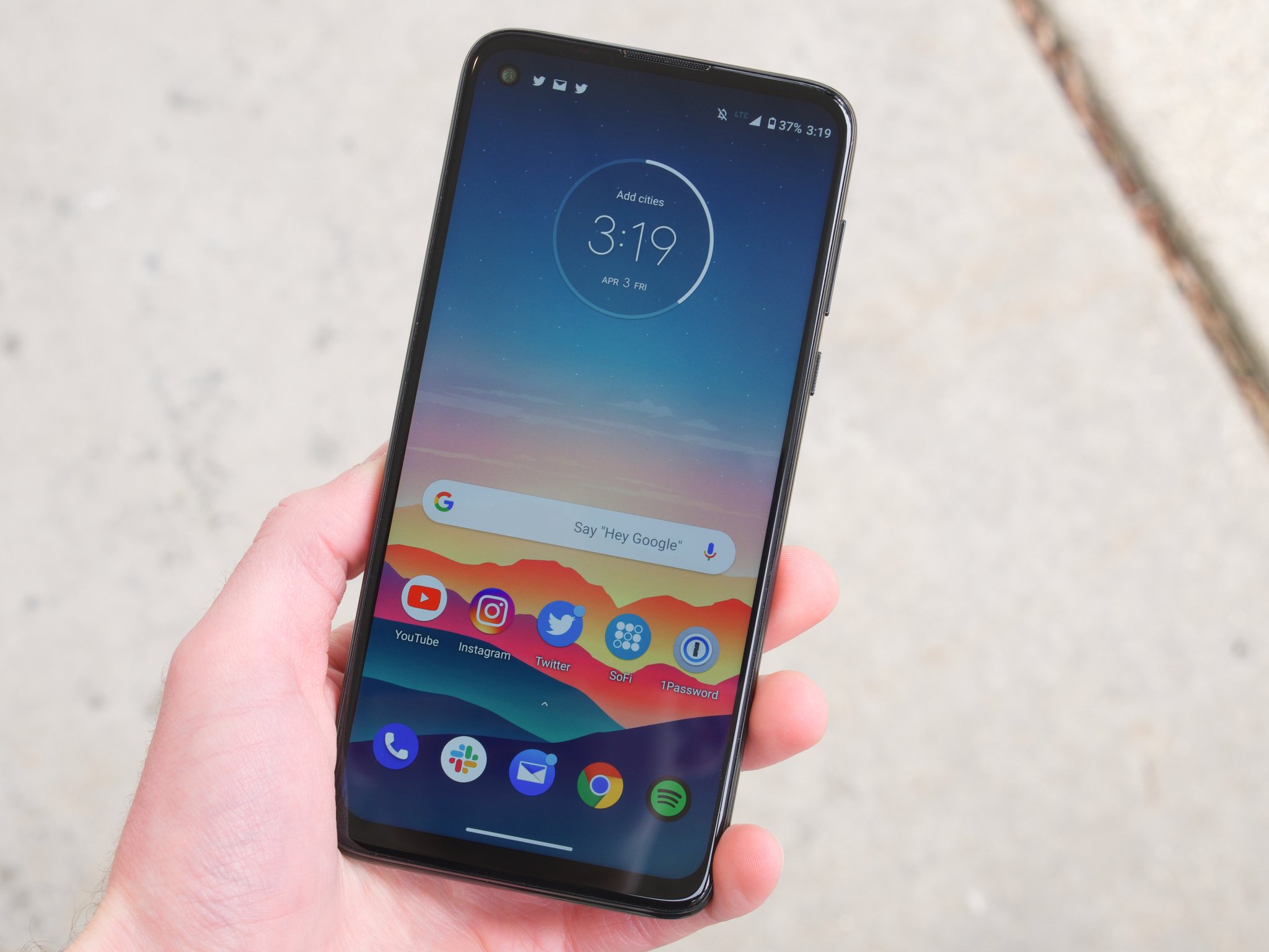
At the risk of sounding jaded or cynical, I just don't care that much about how my phone looks anymore. I still enjoy finding new wallpapers from time to time, but that's about the extent of my customization efforts. Whenever I get a new Android phone, it gets the exact same home screen treatment that my previous one had. There are two home screens, all with the same app shortcuts, Google's At a Glance widget on the first one, and a Google Calendar widget on the second home page. That's it.
It looks a lot more boring compared to home screens of my past, but I've gotten to a point where I'd much rather have function over form. With my current home screen layout, I know where everything is, I have easy access to the apps I use the most, and it takes just a couple of minutes to set it all up when I get a new phone.
This probably has something to do with how my relationship with smartphones has changed over the years. Right now, my daily Android phone of choice is the Pixel 4a — even though there's a Galaxy Note 20 Ultra sitting in my closet that I could just as easily use. The Pixel 4a may not have the absolute specs, but as a tool for getting me through my workday, it's perfect. The display looks great, it runs all of the apps that I use without any problems, the phone's lightweight and easy to use with one hand, and the $350 price tag is unbeatable.
Just like Jeramy said he bought the Pixel 4a because he wanted "a good, simple phone," I keep my home screens the way I do because I want a good, simple layout. It's something that works, I don't have to think too much about it, and that's all I want anymore.
I want to mention that I say all of this without the intent of looking down at people that go all-out with home screen customizing — I'm honestly thrilled that people are getting excited about phone customization again. It's a really great way to get those creative juices flowing and to have a bit of fun, and in the bleak timeline we've been treated to this year, having fun is something we could all use more of. For me, personally, I find that going the simple route has been the best fit for the way I use my phone.
The best home screen is the one that's the best for you — whether it's overly simplified or loaded with all of the custom icon packs and widgets you could fit on it. If it's a layout that you enjoy and are happy with, that's all that really matters.
With that said, I'm now interested to hear how you manage your home screen. Do you find yourself cycling through new themes and layouts on a regular basis, have you gone the ultra-minimalistic route, or do you fall somewhere in the middle? Drop a comment below and let me know!
Simple phone
Google Pixel 4a
$350 at Amazon $350 at Best Buy
Everything you need, nothing you don't
The Pixel 4a is a boring phone in the best way possible. It doesn't have a flashy design or groundbreaking features, but it delivers great performance, reliable specs, and a thoroughly enjoyable user experience for just $350. You just can't go wrong with it.
from Android Central - Android Forums, News, Reviews, Help and Android Wallpapers https://ift.tt/2Hwnlsw
via IFTTT


ليست هناك تعليقات: